Contact Us

Use the form on the right to contact us.


123 Street Avenue, City Town, 99999

(123) 555-6789

email@address.com


You can set your address, phone number, email and site description in the settings tab.
Link to read me page with more information.

Stories From The Studio

ART, Cider, & Mother's Day 🌿

Erin Daniels

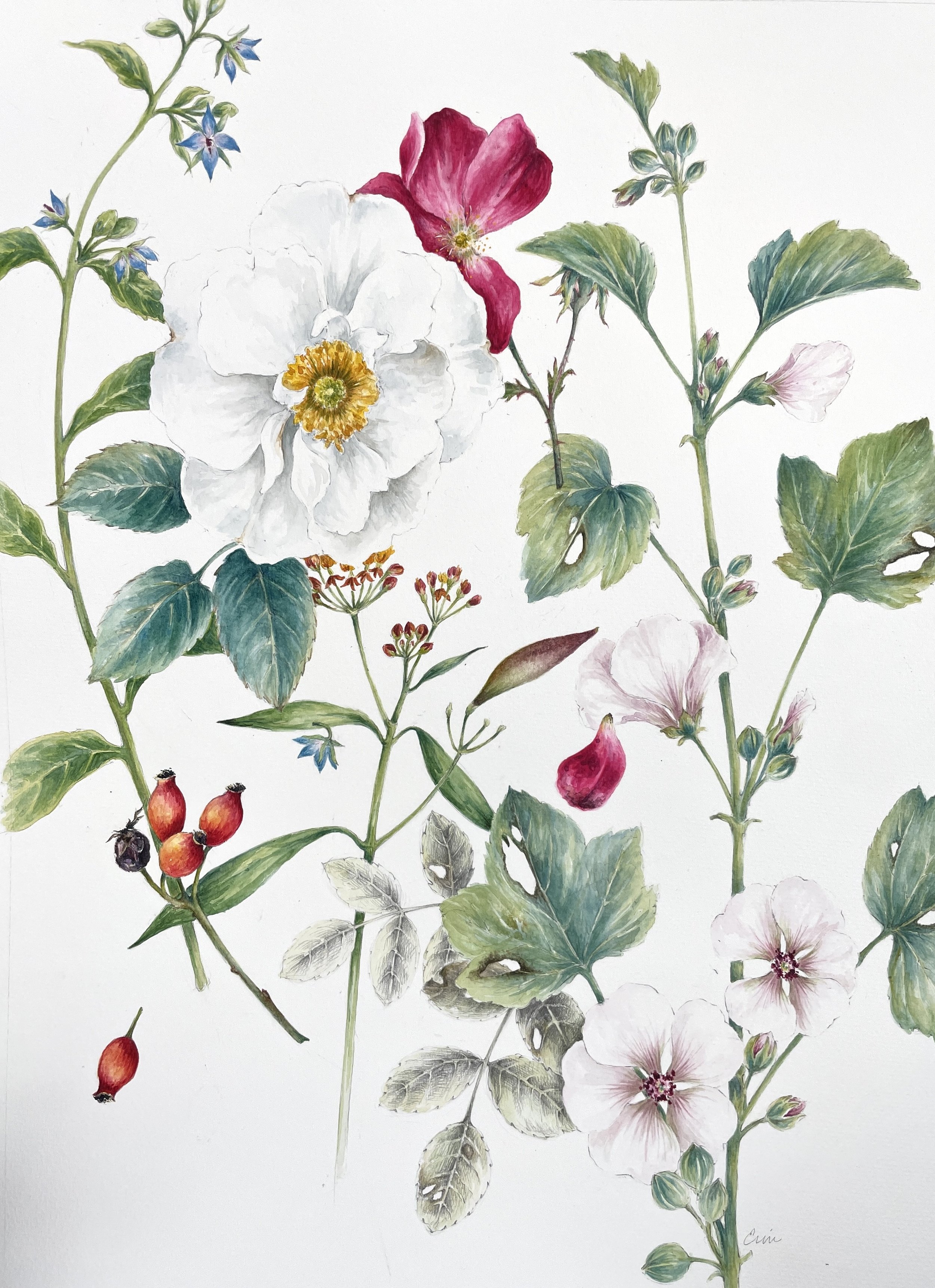
Travel back in time with a visit to Historic Yellow Springs in Chester Springs, PA. Historic Yellow Springs is a living village steeped in a distinguished history, tradition, and folklore that stirs the imagination of those who visit. The village spans 300 years of American history. Today, the village includes 11 buildings and 142 acres. It is the ideal time of year to visit the restored Revolutionary War Medicinal Herb Garden (interpreted in my botanical watercolor seen below)

I have 5 framed pieces, 8 framed “minis”, and 20 unframed portfolio pieces available for sale at the 51st Annual Historic Yellow Springs Art Show.

As the longest-running and most esteemed juried art show in Chester County, PA the Yellow Springs Art Show unveils new artistic talent annually, providing a distinctive cultural experience for thousands to embrace. The exhibition boasts over 3,500 works of art, spanning a variety of media including ceramics, sculpture, watercolor, pastels, and oil. The proceeds from the show play a pivotal role in sustaining and expanding the mission and impact of Historic Yellow Springs, funding conservation projects, arts education programming, and historical experiences that benefit the community at large.

The show opens to the public on Saturday, April 27 at 10 am. The galleries in the Lincoln building will be open daily from 10 am - 4 pm through Sunday, May 12.

Admission is free to the public, and reservations are not required.

And do yourself a favor and stop by Excursion Ciders while you’re in the area. Enjoy the relaxed and friendly atmosphere at their Historic Kimberton Village tasting room. You won’t be disappointed with the PA Dutch Charcuterie Platter and a flight of their fabulous local ciders. We look forward to visiting again SOON!

Excursion Ciders 14 Prizer Rd, Phoenixville, Pennsylvania 19460 @excursionciders

“A Selection of Plants from the Medicinal Herb Garden at Historic Yellow Springs” available at Yellow Springs Art Show.

“Garden Diary: Spring” available at Yellow Springs Art Show.

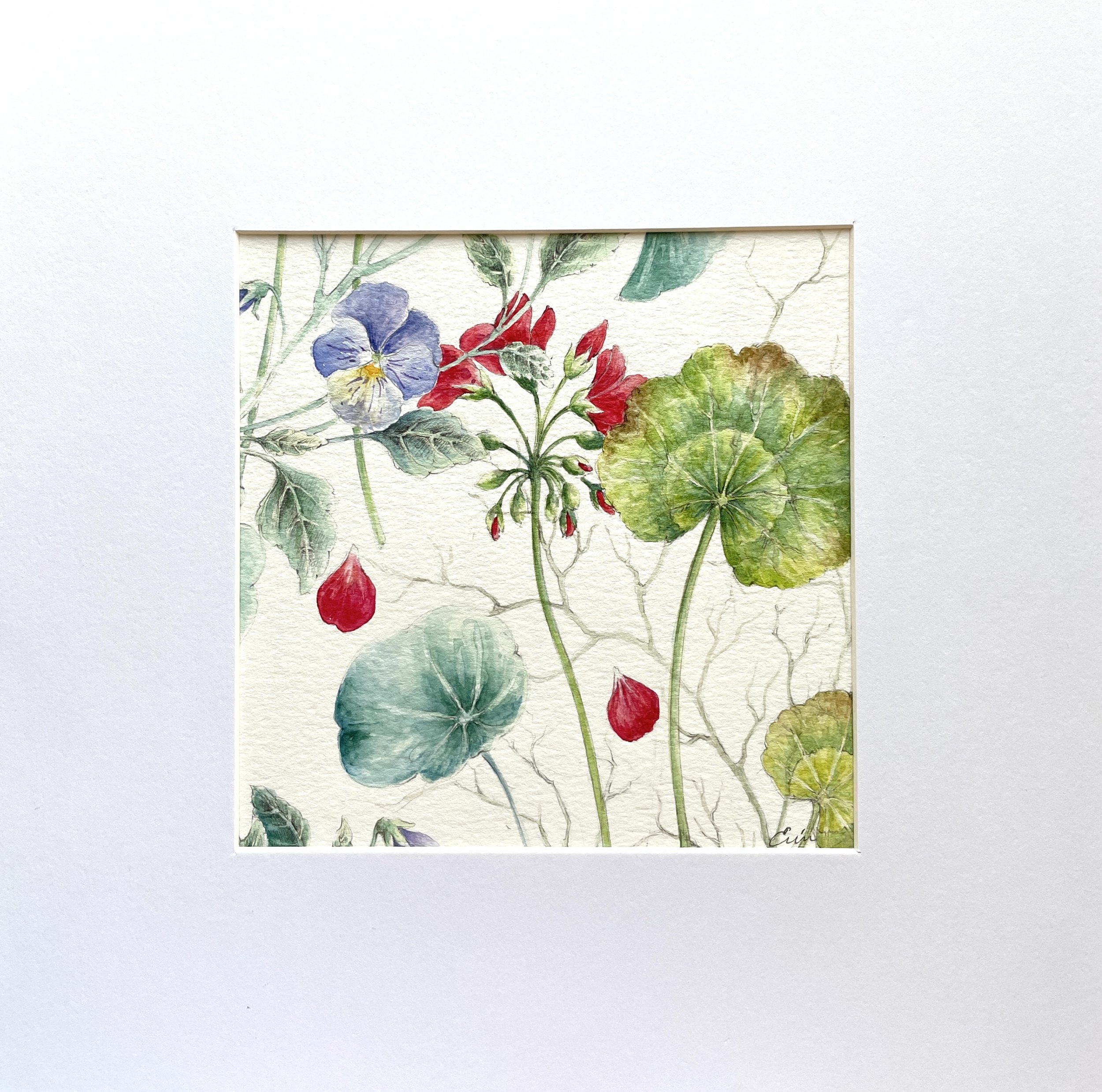
Botanical “Minis” (10” x 10” framed) available at Yellow Springs Art Show.


BACK IN STOCK 🌿

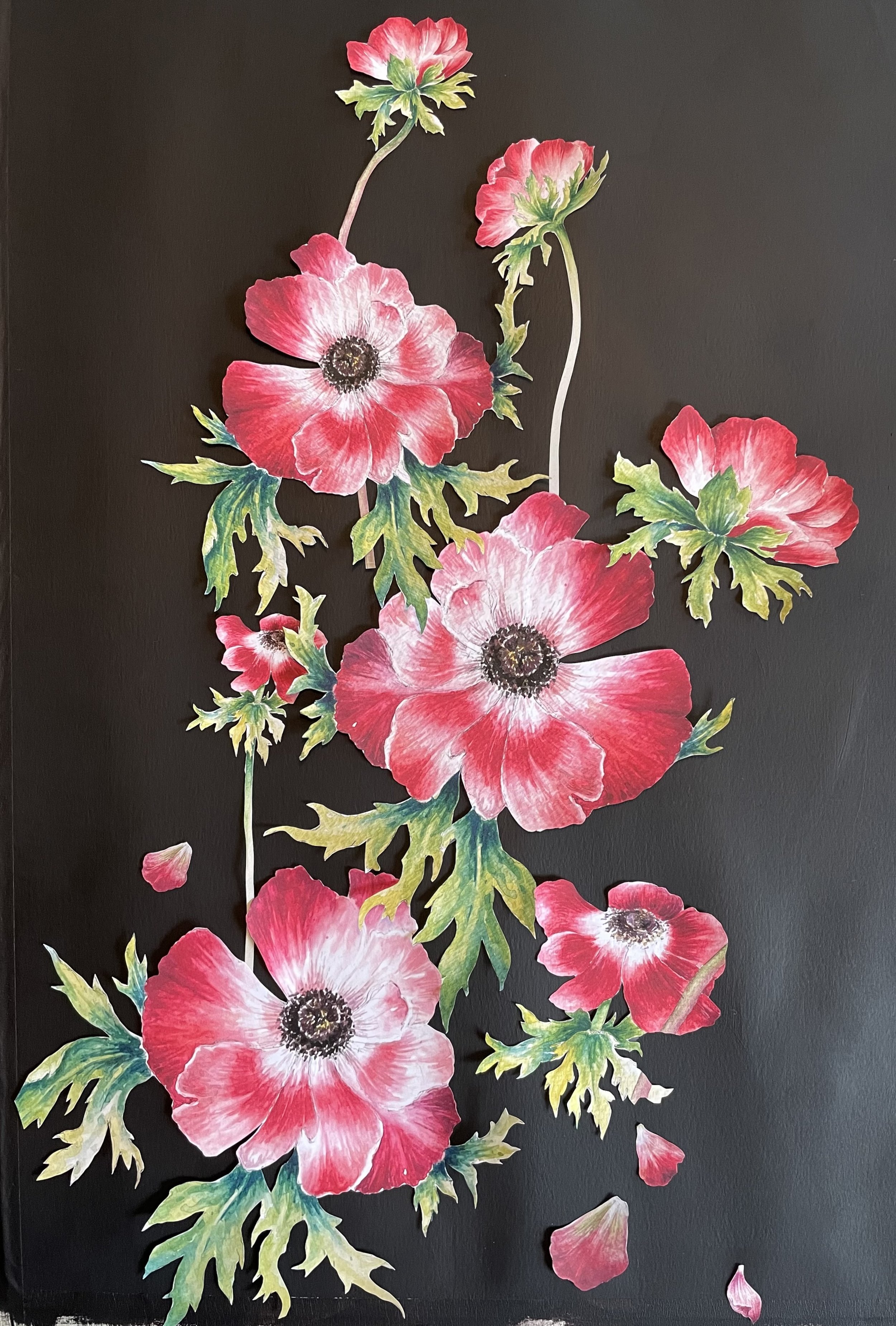
“Midnight Garden” notecards are back in stock just in time for Mother’s Day gifting!

These vibrant reproductions of my one-of-a-kind cut paper botanical collages are printed on top-quality card stock. One each of six designs & envelopes.

Use discount code MOTHER at checkout to receive 15% off your entire order and as always, free shipping.


The Homestead & Clara's Wedding Dress

Erin Daniels

Letters are among the most significant memorial a person can leave behind them.
— Goethe

Sisters, Martha “Annie” and Mary Elizabeth, at the Stewart Homestead. Glasgow, DE.


Clara is married she was married in an old rose color cashmere dress hat to match and a beautiful ecru cloth cape trimmed with satin ribbon. Ella made them for her.
— April 19, 1894

An excerpt from a letter between sisters, Annie and Mary Elizabeth Stewart, describing the wedding attire of their niece, Clara.

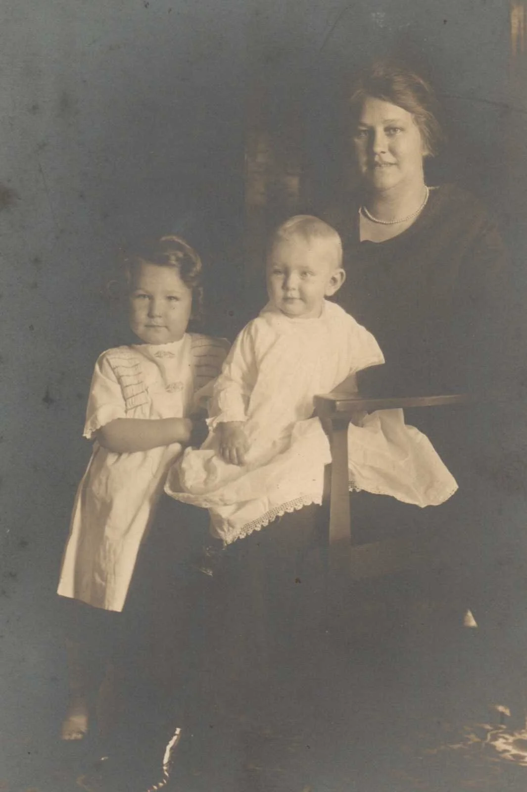
Annie Stewart Willis was my great, great grandmother and a small collection of letters written to her from her sister, Mary Elizabeth, were amongst her meager but treasured possessions. Annie and Mary Elizabeth grew up on the Stewart family homestead in Glasgow, DE. They were a farming family, descended from an early Irish settler of the “Pencader Hundred” (a portion of of William Penn’s Welsh Tract) and lived, until the late 1800’s, on the family homestead. The home (seen above), where the girls grew up with their Father, was at some point extended from the original log cabin (smaller section on left) to create a comfortable family home. The sudden death of their Father, the subsequent marriage of Annie, and the necessary sale of the family homestead separated the sisters for the first time in their lives.

As the “keeper of family history” their letters, brittle with age but full of lively stories, were entrusted to me. The joys, sorrows, and tales of 2 sisters, suddenly separated by marriage and distance, expressed in these letters have brought to life my ancestors who died over half a century before I was born. And while my genealogical research is full of facts and dates that allow me to create a “timeline”, the trunk and branches of my family tree, the “lives” of these people, the leaves of the tree, are created from the invaluable colorful personal details contained in letters like these. So thank you, Mary Elizabeth, for your lovely description of Clara’s “old rose color cashmere dress” and for reaching down through the ages to bring my history to life.

The next time you’re ready to dash off an email or a text to a loved one, take a moment, pick up a pen and write a handwritten note instead. You never know what kind of impact a simple handwritten note can make, either now or to a future genealogist in your family! 💌

Detail of a letter written to my gg grandmother, Annie Stewart Willis.


"Trash Rose" to Treasure 🥀

Erin Daniels

You can call it “upcycling” or “repurposing”, but basically I am a self-proclaimed trash picker. I usually go for a short walk at lunchtime and my husband dreads the days when I walk back in the front door and say, “Are you busy??”. He knows what that means: “I found something on the curb that was too heavy for me to carry home so can you please go pick it up?”!!

So when I came home one day a few winters ago dragging a seemingly dead tangle of roots and stems he wasn't particularly surprised. This sad and discarded plant lovingly became known as the “Trash Rose”. I am happy to report after 2 years she is flourishing in the cottage garden. The luscious wine red is not a color I normally would have chosen but it is in stunning contrast to the golden yellow Coreopsis and magenta Rose Campion that have sprung up nearby. Mother Nature really has the best eye for color

I look forward to capturing this beauty in watercolor very soon!

The infamous “Trash Rose” framed by

exquisite “Orangerie” wallpaper from Farrow & Ball.


I am looking forward to visiting my alma mater, Moore College of Art & Design, this weekend for the opening of the 2023 Alumni Invitational. I will be showing 2 of my hand embroidered pieces apropos of my Bachelor of Fine Arts degree in Textile Design. If you are in or around the Philadelphia area this summer do try to pop in and have a look - the exhibit runs through Sept. 1.


By Design: 2023 Alumni Invitational Exhibition

June 3 – September 1, 2023

This year’s presentation celebrates the work of Moore’s alumni who earned degrees in design-based fields including Fashion Design, Graphic Design, Illustration, and Textile Design. Graduates who received their BFA on anniversary years 1963, 1973, 1983, 1993, 2023 and 2013 were invited to submit projects for consideration and the exhibition features work by twelve graduates in a variety of media. The selections demonstrate a mastery of materials over a broad range of practices and reminds us that creative production is an inherent part of life after Moore. These alumni provide inspiration as committed makers both in their professional and personal spaces.

Artists in the exhibition: Niarus Benjamin Walker ’93, Jean Broden ’83, Mary Jo Brown ’83, Erin Daniels ’93, Diane Deery ’93, Renee Derr ’03, Michelle "Shell" Kennedy ’83, Suzanne Kopko ’93, Rachel Lopez Cerrato ’13, Kathy Mueller ’03, Andrea Pinkowitz ’73 and Jessica Robles ’03.

Detail of “Healing Sutra 2”. Hand Embroidery on Vintage Textile.

On exhibit at Moore College of Art & Design through Sept. 1.

Collage & Perennial Peas

Erin Daniels

The famous painter Georgia O’Keeffe wrote about her feelings of emptiness and depletion after an exhibit and her words ring true. If you have been following along over the past year and a half you have seen and heard a lot about the preparations for my solo exhibit, “Garden of the Soul”, at Hood College. A true labor of love, “Garden of the Soul”, was an unequivocal success and I am so grateful for everyone’s love and support. I feel certain that all of my “artistic ancestors” would be proud! I am in talks with another possible venue for the exhibit - also with a personal tie - so stay tuned and fingers crossed!

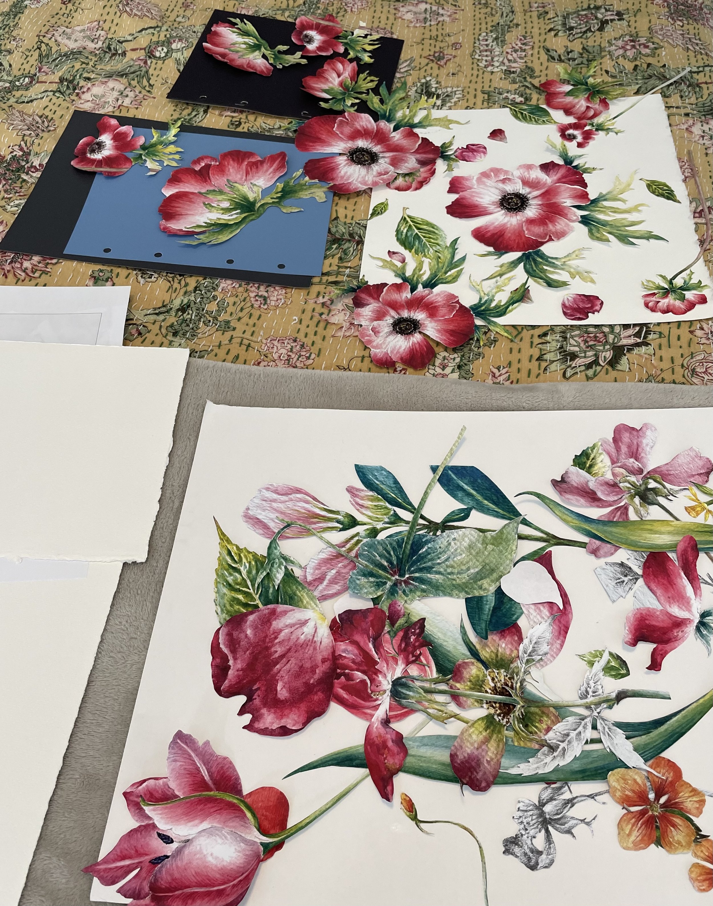
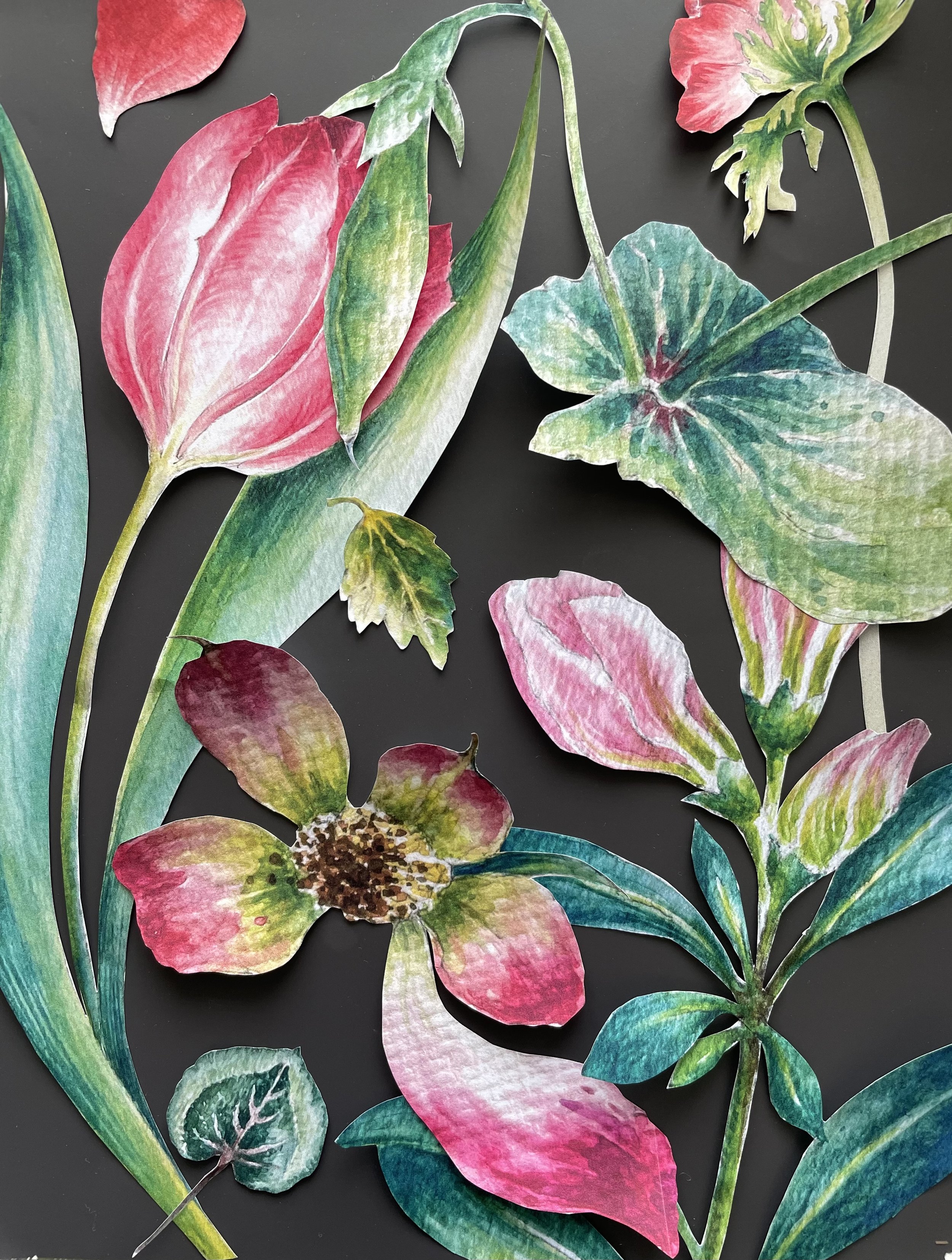
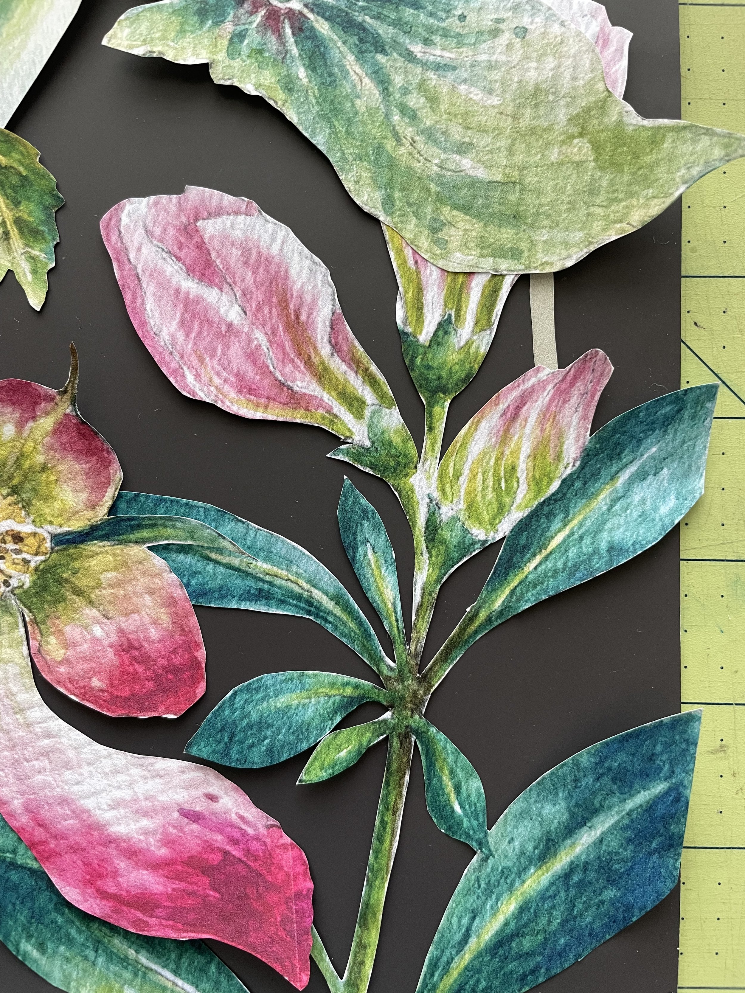
In the month since the show came down, I have had the opportunity to relax a bit, read a lot, get my hands dirty in the garden, and reflect on where my work is headed next. I’ve been playing with collage and having lots of fun snipping away and arranging elements from my watercolor botanicals into new patterns. (see photos above)

Envisioning the pure joy and beauty of being enveloped by these luscious patterns I have contracted with a pattern designer from the UK to translate my collages into wallpaper patterns. I am very excited and will keep you updated as to when samples are available!


OXFORD FINE ARTS ~ MAY 19-21 ~ OXFORD, MD

One of the benefits of preparing a gallery full of work for Hood is that I will have lots of new work on offer at Oxford Fine Arts this coming weekend! No last-minute scramble to have work framed and ready - that’s a first for me!

One of my favorite weekends of the year, Oxford Fine Arts never fails to disappoint with great art, food, and friendship all against the charming backdrop of Oxford, MD. Again this year I will be donating an original botanical watercolor to the auction and tickets are available here. (You do not need to be present to win).

My original botanical watercolor, “Perennial Sweet Pea”, was inspired by these recurring sweet peas, grown from seed, in my own cottage garden. The site of these magenta flowers in the wild, blooming alongside showy orange tiger lilies, is a vivid memory from childhood and still a favorite garden pairing.

Also a favorite of Thomas Jefferson, seeds are available from the Monticello Shop. From the website description - Perennial Pea is a summer-flowering vine that Thomas Jefferson sowed in one of the oval beds at Monticello in 1807. It was an established garden plant in America before 1720. Perennial Pea is a long-lived vigorous climber with attractive blue-green leaves and showy flowers in red, pink, or rarely, white.

"Garden of the Soul" Botanical Watercolors by Erin Daniels

Erin Daniels

My upcoming exhibit, “Garden of the Soul”, is the culmination of years of work and research inspired by a small, tattered book gifted to me after the death of my beloved Nana. The book had belonged to her great-grandmother, Elizabeth Kelly, and was a gift to “Eliza” when she embarked on her emigration to Philadelphia from Greencastle (Belfast), IRE in 1875. The spiritual tome, worn ragged by generations of hopes and worries, is titled “Garden of the Soul” and upon first touching it and reading the heartfelt inscription inside it’s cover I felt as if I held a living link to my past. The seed was planted for an artistic endeavor so encompassing I could not even imagine it at the time. That tiny seed has flourished over years of research, work, and contemplation, to finally blossom with this exhibit.

“Garden of the Soul” as inscribed to Elizabeth Kelly. June 13th 1875.

“Garden of the Soul” explores Legacy, Lineage, and a Sense of Place as expressed through botanical watercolors. A familial connection to Hood College makes this the ideal venue for this exhibit as my son, James, is currently a junior at Hood and my great-aunt, Elizabeth Rose Long (also a direct descendant of Elizabeth Kelly), attended Hood in the 1930’s at the tender age of 16!

The exhibit will open Monday, March 20, 2023 (appropriately the first day of Spring) and close on April 14, 2023. There will be an opening reception open to all on Saturday, April 1 from 2-4 pm - I hope to see you there!

Is it in my DNA? 🧬

Erin Daniels

Nature or Nurture?

While my creativity has been encouraged since early childhood, I’ve long suspected that being an artist is in my DNA. Creating has always come easily to me and the ability to observe something and recreate it on paper is as natural to me as breathing. People ask me all the time. “how did you do that?” and I really don’t have an earth shattering answer - I just “do it”!

For my upcoming exhibit at Hood College, the theme of family ties and legacy took center stage. See “Garden of the Soul - The Seed” for the reasons why, and I’ve taken a deep dive into the family tree, exploring my inheritance of artistic ability.

I have written previously about my Nana, Margaret, who has been my biggest artistic inspiration (as well as the inspiration for the name of my business - see “What’s In a Name” ) but I have many more creatives in my family tree. Following is just a snippet of the talent that graces my tree - there are many more folks (living and dead) that carry the “artist DNA”. I love the idea that little bits of each one of these ancestors has come together to make me the unique artist I am today. I hope you enjoy!

(I have omitted surnames to protect the privacy of living relatives)


Thomas Patton

Born in Greenscastle, Ireland (a suburb of Belfast) around 1840, Thomas emigrated to Philadelphia in 1869. In the 1880 & 1890 census I found Thomas’ profession listed as “Artist”. (This discovery sparked my interest in exploring my artistic legacy through genealogy.) In the 1920 census he is listed as an “Artist” with an added notation of “Landscapes”. I have yet to find any evidence of Thomas’ work (or even a picture of him) but it is possible that he did commercial scenery work for the theater. The search continues as I use DNA and old fashioned research to hunt down the elusive artist, Thomas!


Jennie Elizabeth (niece of Thomas)

My great-grandmother who is listed as a “hat trimmer” in the 1900 Philadelphia census.

The Edwardian fashion era (1901-1910) is often remembered by large over-sized hats stacked with plumes of feathers, bows, flowers, birds, lace, and tulle. What fun it must have been to create these works of art!


Nelson Edmund (husband of Jennie)

An original pastel painting by “Nels” that hangs in my home. Though he was an insurance salesman by profession his artistic talent is evident in this fashionable portrait from 1905.


Margaret Dorothea (daughter of Jennie & Nelson)

One of a series of Illustrations done by “Peg” during her time as a Fashion Illustration student at Moore College of Art in Philadelphia. (also my alma mater)


Thanks for reading and as always please keep in touch xo Erin

margaretjamesdesign@gmail.com ~ 609-226-7708

"Color It Pretty" by Danielle Davies/Cape May Magazine

Erin Daniels

Color is all around us. From the moody blue greens of the Atlantic Ocean and the green-to-gold dune grasses on our beaches to bright red stop signs and bold striped awnings, color brightens our surroundings and catches our eye, transforming bleak landscapes to ones that excite and inspire. And don’t even get us started on rainbows, flowers, and sidewalk chalk—color is everywhere, and it is wonderful.

Why, then, do so many of us resist using color in our homes, sticking to the safety of creams and whites, beiges, and tans?

“A lot of people are intimidated by color and their first reaction might be ‘I don’t like color’,” says Erin Daniels of Cape May Decorating Co. “In people’s minds, color is the rainbow. Bright, primary colors, or a box of crayons. They’re not thinking of the subtleties and the faint shades of colors that you can use. So, I think just the word ‘color’ sometimes intimidates people.”

Daniels is an expert on the topic. A watercolor artist, her design specialty is color consultation. This designer has the unique ability to recognize the color within other colors and to select the perfect hues for both her clients as well as her artwork.

Wallpaper and paint selection for a private residence in Cape May. The color and pattern of the home’s original stained glass served as inspiration. Photo courtesy of Erin Daniels.

So how does she help guide people to explore color?

“Sometimes people will flat out say they’re afraid of using or even picking a color,” says Daniels. “I’ll say, ‘let’s take a look at a fan deck and you just point, show me what you like, what appeals to you.’ People can look at something and point to it and not know the words to use, but they know what they like and dislike. You could have the most indecisive person, but I’m pretty sure I could get them to point to two colors and say, ‘I like this one and not that one.’”

Of course, different people have different preferences. One person’s subtle use of color is another person’s daring incorporation of a new hue.

“For the most part, when I walk into someone’s home, I can tell right away how comfortable they are using color,” says Daniels. “I guess intuitively, I can tell how far I can push someone. If I got into somebody’s house and it’s all neutrals—which is fine, it’s their preference—I’m not going to suggest doing an orange wall or something.”

More than that, Daniels, like most designers, has tons of experience not just with customers but with color as a stand-alone concept. As a professional, she can guide both the design-intimidated just as well as the bolder client.

“Sometimes it’s just the intimidation of looking at that little one-by-one inch square of color and they can’t visualize how it would look on the walls,” says Daniels. “Like, I see you like this pink for your daughter’s room, but I know from experience that if you put this pretty pink on four walls, it’s going to be glowing and keep her up at night. I see where you’re going and get a sense of what you want, and this is not going to get you there. Let me show you some other options.”

A designer is always a great option. But what about those who want to go the DIY route? When people are selecting paint colors, paint swatches are the starting point. And while most DIYers tend to either tape or hold paint swatches against a wall—or even paint samples directly onto it—Daniels has another suggestion.

“If you’re going to pick a bold color, or even any color, paint yourself a large swatch on white poster board, not on the wall,” says Daniels, who recommends leaving the edges of the poster board white. “Say your walls are green and you want them to be pink, and you paint a huge square of pink on the wall. First, the green underneath is going to most likely show through unless you do two or three coats of a good paint. And your eye is seeing that green around the pink as you’re looking at the wall, which affects the way you see the pink. You want to isolate the color, so your eye is really seeing it.”
Sample pots of paints are great, but keep in mind that those aren’t necessarily the same formula as the paint you’ll later buy. Because they are thinner and with less pigment to them, you’ll want to add several coats to your poster board to have an accurate representation of the color you’re shooting for.

Likewise, play around with your large sample or samples. While you can always paint over a color you don’t like, it’s a lot more efficient to pick a good color from the get-go.

“Move it around. Put it in a shadowy corner. Put it in a bright part,” says Daniels. “Some people are fine with making a decision and just accepting that they have to live with it. For most people, I recommend living with [the sample] for at least a couple of days where you can see it at different times of day. You’re looking at it at night with your lights on, with your lights off—even sunny days and cloudy days can make a difference. Just put it up on the wall and when you walk in the room and glance at it. Does it feel good? Or is it like ‘Whoa, that’s a lot.’”

Furthermore, Daniels urges caution when choosing a color based off a popular site like Pinterest. She cites the many variables that can affect the way a color looks in any of the pictures, or in a particular house. These include the direction the room faces, the color of the floors, the natural light, and the fixed finishes, countertops, and cabinets, among others.

Picking a color is one thing, but aren’t there some rules we need to follow?

“I have seen people break every rule and have it look amazing,” says Daniels. “I think getting into color theory with someone is making it way more complicated. People know what they like when they see it.” Though Daniels doesn’t rely on specific rules regarding color theory and color schemes, she does recommend a few things to make a home feel cohesive.

“Part of it is using the right color placement for the type of home you have,” says Daniels. “If you have an open concept house, and you’re going to be seeing a lot of different walls and a lot of different spaces at the same time, you probably don’t want them to be six different colors, because it’s a lot for your eye to be looking at. You also don’t want to have neutrals on all your walls and then have one room be bright orange. It just doesn’t work. It’s jarring.”

If you do choose to paint every room a different color, Daniels recommends choosing colors that all work together and flow well. That type of flow, and the addition of unifying elements, can add to the cohesiveness of the home.

“I would recommend keeping trim and things like that the same throughout the house. It gives your eye a place to rest,” says Daniels. “And if you’re going to be using bold colors, I would say pick some kind of neutral you could use throughout the house that would be a unifying visual with white or linen color or even black, so you can have a little bit of it at least in each room to tie everything together.”

For those of us already sold on color, but worry about our changing tastes and styles, Daniels has some non-paint suggestions.

Color trends come and go. Remember millennial pink? It’s long gone. Dark, moody greens and navy blues have been big more recently, but those too are starting to wane in popularity. And the Pantone Color of the Year—Veri Peri, a bold periwinkle—is stunning and eye-catching, but something that seems unlikely to be found as the primary color in someone’s living room.

“I always say to people, you can always incorporate color with your artwork or with your accessories, pillows, throws—things that are easy to change. Because even if it’s a bold color and you love it now, you may not always,” says Daniels. “Changeable elements are where you can take a risk.”

The key, of course, is finding what works for you.

“I may know this color is going to technically look better than this other one, but if you’re not comfortable with it, then what’s the point?” says Daniels. “It’s your house.” ■

"Garden of The Soul" - The Seed

Erin Daniels

I am thrilled to announce that I have been invited to present a solo exhibit of my work at the Hodson Gallery, Tatem Arts Center at Hood College in Frederick, MD.

The exhibit will open Monday, March 20, 2023 (appropriately the first day of Spring) and close on April 14, 2023. There will be an opening reception open to all on Saturday, April 1 - SAVE THE DATE!

Tatem Arts Center at Hood College.

(image courtesy of @hoodcollegegalleries)

The entire concept of the show has been inspired by my treasured possession (seen below), a small book entitled “Garden of the Soul”, that belonged to my great, great grandmother Elizabeth Kelly.

My exhibit, also called “Garden of the Soul”, will be a botanical tribute to the lost stories of one branch of my maternal family tree. I will be sharing these stories here, bi-weekly, leading up to the exhibit, and hope you will follow along.

Before I knew there was a thing called genealogy, I was curious about my family’s past. From a young age, I was acutely aware of wanting to know “where did I come from?”, “who do I look like?”, “where did I get the traits that added up to create me?”.

Even as a small child, I liked the sense of connection from hearing the phrase, “You inherited your artistic talent from Nana” (my beloved maternal grandmother). It conjured up images of a precious gift handed to me - something that made me special. But where did Nana “get it” I wondered?

In the quest to create “portraits” of my ancestors (not literal faces necessarily, but the details and stories that truly create a life), I have spent countless hours scouring census records, birth, marriage, and death records, newspapers, obscure genealogy research sites and more recently DNA, to build a picture of my past.

When I began painting my botanical watercolors in March 2020, I truly began to sense the intersection of my Art and family history research. The use of plant metaphors in genealogy (the family tree with its branches and leaves) is the obvious connection and my current work is inspired by, and a connection to, my family roots.

My upcoming solo exhibit (details below) at Hood College in Frederick, MD is a perfect example of this intersection. The show, titled “Garden of the Soul”, is a botanical “portrait” of my maternal family line back to our first known ancestor in Belfast, N.I.

One of the leaves along this branch of my tree is my great-aunt, Elizabeth Rose “Betty” L. (I am not using last names to protect the privacy of living relatives), who I discovered attended Hood College from 1932-33 at the age of 16. It was pure coincidence that my son, James, chose to attend Hood College. It was not until after he committed to this small, private college in western Maryland did we discover the family connection! What are the chances?! When the opportunity arose to exhibit this body of work at Hood, I knew it was an opportunity of a lifetime to share the culmination of years of study, artistic practice, and genealogical research.

I look forward to sharing my journey and more tales like this in the year leading up to my exhibit and I hope you will follow along! x Erin

Elizabeth Rose L. (my great-Aunt Betty)

b.1916 Philadelphia, PA d. 2006

Attended Hood College 1932-33 at 16 years old


James Emerson E. (my son)

b. 2002 Somers Point, NJ

Class of 2024 Hood College

Going Gray

Erin Daniels

“Going Gray”

By Danielle Davies ~ Cape May Magazine ~ Fall 2021

Once upon a time, in the not-so-distant past, people thought the color gray was pretty depressing. We wanted nothing to do with it, as a paint color or a hair color. Gray, in fact, literally seemed to represent the exact opposite of what we wanted in our lives: where we wanted light and sunshine, gray was dour, drab, and old.

And then just like that, in what seemed a snap of the fingers, gray took on new life. Suddenly we were seeing every imaginable shade of gray everywhere, from interiors and exteriors to hair dyes. And while the gray trend started a while ago, it’s become a ubiquitous hue.
“I don’t think it will ever go out of style,” says Erin Daniels of Cape May Decorating Co. “I think one reason gray is so popular is that it’s really accessible and it feels fairly easy to pick. People get overwhelmed with color. You can work gray into a lot of different schemes a little easier.”

Daniels should know. A longtime watercolor artist, she began doing color consultations—as well as interior design—several years ago, first through Sherwin Williams, and then independently. The color consultation portion of her services grew so busy that it has become her primary focus. “I’m an artist, first and foremost,” says Daniels. “So, I’ve been using color basically my whole life.”

For those in need of a color consultant, the process with Daniels involves a 90-minute on-site color consultation. “There are so many variables that can affect color.”
Daniels explains that everything in a home, from the direction of the room (is it north facing or south facing?), to the natural light, to the number of trees outside (the reflection of the green will change the color of your walls), to the flooring color (which will reflect up onto the walls and change the color) can all affect the way paint looks on the walls.

“That’s why I do the color consultations onsite. I want to be in the space,” she says.
Daniels often consults with homeowners who have a flair for decorating but who are stuck with 50 paint swatches on the wall. Likewise, she’ll work with painters and builders on new builds. “We just work together narrowing down how they want the house to feel,” says Daniels. “I find it easier for people to describe how they want it to feel than how they want it to look.”

And while Daniels is a huge proponent of color, she understands the allure of neutrals. “Gray has definitely been the ‘in’ color,” says Daniels.

Though she sees things going towards warmer neutrals, Daniels doesn’t dismiss the charm of gray. “There are definitely ways to use it, especially here in a coastal palette,” says Daniels. “It’s very clean looking. If done right, it can be very sophisticated. It’s just a matter of getting the right gray and pairing it with the right colors.”
The thing about the color gray is that it can range from drab to cozy to elegant to bold. “Gray can go either way,” says Daniels about the hue’s versatility. “I’ll ask people ‘how do you want your master bedroom to feel?’ If the answer is relaxing and soft but light and bright, spa-like, Sea Salt by Sherwin Williams could be your color. It’s technically a gray, but it has a bit of green and a bit of blue in it, so depending upon how the light hits it, it can go either way. It’s a beautiful color, a great neutral without being just a flat gray. It’s a light color, not depressing at all.”
While gray can be spa-like, almost ethereal, and a reflection of the sand, water, and sky at the shore—the perfect backdrop to the white slip-covered furniture and jute rugs of many coastal homes—it can also be bold and daring.
“If you go to the total opposite end, there is a British paint company called Farrow and Ball, and they have a color called Railings, which is really, really, really dark gray, almost black, but it has some blue in it, which is super dramatic and moody,” says Daniels. “It just depends on the look you’re going for. I don’t use dark colors like that very often in the coastal homes that I do, but in a historic home or a home on the mainland, it’s definitely the kind of color that is hot right now.”

Of course, these are far from the only grays, and are not the only ones Daniels uses or recommends. All of that has to do with the aforementioned variables which can change the look of a paint color.
“People say, ‘Oh, my friend used Sea Salt and it looks great, but I tried it and it looks terrible,” says Daniels. “I might have someone with that 1990s reddish oak wood flooring and trim, and they want to paint everything a cool gray. Well, that cool gray is not going to complement that kind of orangey oak. So, I try to steer them more towards a ‘greige,’ which is a grayish beige.” In that case, Daniels suggests that a greige such as Modern Gray from Sherwin Williams or Edgecomb Gray from Benjamin Moore might work.
Like other colors, gray doesn’t work in a vacuumAnd though Daniels stresses a décor style that flows through the house, it also doesn’t have to be monochromatic.
“One thing I like for coastal homes, if people want a gray like Sea Salt, is when they go a bit bolder with the accent,” says Daniels. “It’s fine to pick a nice neutral for the walls and then you can have a little fun with the decorating. It frees you up to do something a little more fun. You can use aqua and coral with gray, which is a nice combination. Another of my favorite combinations if you use more of a greige on the wall is to use crisp navy and white. It’s a classic. You can’t go wrong with that.”
Additionally, there’s the use of gray without any obvious gray around. It turns out that gray is present in many paint colors, as it’s often used to mute a brighter tone.
“Maybe someone has this beautiful soothing palette in their home and then you get to the bedroom, and they want a bright purple—something incongruous with the rest of the palette,” says Daniels. “I can show them some lavenders with a bit of gray in them.”
“My job is to show people how they can use color, even if it’s just a hint of it—a gray with a hint of blue or a hint of green,” says Daniels. “What people like about gray is that it’s soft, it’s soothing. I don’t know that it’s always just the gray, but more the feeling they get from gray. So I can show them some great colors that have gray in them.”
If your plan is to utilize gray in other areas of your décor, Daniels suggests upholstery. “It’s not a bad thing to have a neutral upholstery, like a gray or a linen color, or something to give your eye a rest,” says Daniels. “Having a lot of pattern and color can be too busy.”
“My job is to show people how they can use color, even if it’s just a hint of it.”

Daniels herself has two gray chairs. “I have a lot of color and wanted a neutral,” she says. “I picked the paint from the Benjamin Moore Historical Collection, which I don’t think you can go wrong with.”
And though gray has even been making quite the appearance on floors—particularly on driftwood vinyl planks—Daniels urges caution.
“You have to really love gray to put it on your floor. It determines the entire palette for your house if flooring is a color,” says Daniels. “Flooring isn’t something you want to replace in five years. I feel like big, permanent or semi-permanent surfaces aren’t the places to go trendy.”
The takeaway, of course, is like all design takeaways: personal preference. As Daniels says, “It’s really a matter of how people want their house to feel.”

My Love/Hate Relationship With Dresses

Erin Daniels

I grew up in the 1970’s when little girls were still expected to wear dresses to Sunday School and family gatherings. 

It was “proper”. And I hated it.

To this day I can vividly remember one particular dress that I despised more than the rest - it was purple plaid with an empire waist - basically hideous, even by 1970’s standards. (just imagine the dress pattern below sewn with the purple plaid fabric on the left)

And to add insult to injury, I had to wear it with white frilly socks (or knit tights - depending on the season), Mary Janes, and WHITE GLOVES to Sunday School!! Can you imagine?! I can still picture my little seven-year-old self seething at the indignity of it all. 

I was very happy wearing my well-worn elastic waist corduroy pants and mismatched shirt - thank you very much. My sister, on the other hand, was a little fashionista and even kept a calendar of what she wore to school every day so she wouldn't wear the same things twice!! (she’ll kill me if she reads this )

I don’t know why I hated wearing dresses so much, but I do have to give credit to my Mom for always making us appear put together and presentable when leaving the house. She and my Nana would make clothes for us (prom and wedding gowns included) and they did instill in me a fabric hoarding instinct that persists to this day.

And then, to my surprise, about 15 years ago the dress imagery started popping up in my artwork. I suppose it was inevitable that the childhood hours spent moping around fabric shops, getting scolded for playing hide and seek between the bolts, and countless hours spent crafting doll dresses from scraps on my Mom’s sewing room floor would have to inspire me eventually. I was already using dress patterns as collage elements in my paintings and on the advice of my mentor, I began creating actual dresses from vintage textiles and embellishing them with hand embroidery. These embroidered dresses took my art in a whole new direction and gained a considerable amount of notoriety in the world of Fiber Art.

And as an artist’s motifs have a way of doing, this little dress form has found its way back into my artwork with my current botanical watercolors. If you look closely you’ll see a shadow of painted embroidery in some of them too.

My “Garden Diary” botanical watercolors are a nod to my Mom, my Nana, and all the creative women in my family who instilled in me a love of fabric, flowers, and all things beautiful. Thank you. 

(In case you’re wondering… despite all these pretty dresses I’m still a jeans and tee-shirt kind of gal!)

Behind The Scenes

Erin Daniels

Every artist dips his brush in his own soul, and paints his own nature into his pictures.
― Henry Ward Beecher

Watercolor artist painting flowers

I’ll admit it, these emails are challenging for me to write. I am much more at home putting pencil and brush to paper than words to a keyboard. As I considered what to write about this week I was thinking back to common questions I’ve gotten over my years as an artist. As queries go, second only to “how long does it take you to do that?”(this was especially painful to consider when I was exhibiting my extraordinarily time consuming hand embroidery :), has been “where do you get your Inspiration?”. 

My standard answer is usually a mumbled something along the lines of, “I don’t really know..umm I think it’s just something I was born with..maybe God?”. And while all of these are true, albeit uninspired answers, if I dig a little deeper I can definitely find more interesting and concrete sources of Inspiration. So I thought I would share a few - in no particular order - that I hope you will enjoy!

“Have nothing in your house that you do not know to be useful, or believe to be beautiful.” ~William Morris

The philosophy of William Morris is one that guides my personal decorating aesthetic. I have tried to create a home and garden as a peaceful and beautiful place for our family to gather and also a place where I am surrounded by Inspiration for my work. Definitely not a minimalist, I mix patterns with abandon and use bold color on the walls as a backdrop for my collections of floral ceramics and artwork. Seasonal mixed bouquets from my garden are the Inspiration for all of my current paintings.

I recently had one of my botanical watercolors digitally printed onto fabric to create these pillows for my wicker garden furniture. All of the flowers in the painting are from my garden.


Since childhood I’ve been enamored with the charming illustrations of Beatrix Potter. Best known for her children's books, such as Peter Rabbit, Beatrix was also an accomplished natural scientist and conservationist. I am currently reading Linda Lear’s in depth biographyand have been introduced to Beatrix Potter’s skillful botanical illustrations. From a very young age Beatrix was encouraged in the art of observation and recording the natural world around her. Her skill as as an illustrator is seen in the images below.

Beatrix Potter Illustration
Beatrix Potter Botanical Illustrations

William Kilburn (1745–1818) was an Irish botanical illustrator, print designer, and calico printer who was best known for his contribution to William Curtis’ Flora Londinensis. Upon seeing Kilburn’s textile designs for the first time I was immediately fascinated with his use of floral motifs intricately combined with seaweed, shells, and ribbons. With his mastery of seamless pattern created from delicate watercolor botanicals Kilburn created designs that are timeless and breathtaking 200 years on.

William Kilburn seaweed
William Kilburn Textile Design

I hope you enjoyed this behind the scenes look at what Inspires me as an artist… now I must get back to the “drawing table”!

The (Almost) Lost Art of Letter Writing

Erin Daniels

There is special magic in a handwritten note that I fear is getting lost in this digital era of text and email. While I am amongst the first to appreciate the convenience and immediacy of electronic communication (e.g. this newsletter!), there is an unmatched thrill in opening the mailbox to find a hand addressed letter or postcard. I’ve long been drawn to the stories and secrets revealed in handwritten notes and letters (I purchased my first vintage postcard at the age of 8) and for years have incorporated these postcards and other forms of written text into my artwork. I love how they bring a sense of history and romance to my work before I even set pencil to paper.

unnamed.jpg

My most recent use of vintage ephemera as a canvas for my artwork is in my “Love Notes From The Chateau” series. There is an elegance and beauty in the handwriting that I find unmatched by digital text. 

A French postcard from my collection is shown here with an antique Chinoiserie fountain pen.

Second only to making art and gardening is my passion for genealogy. I love uncovering the stories and personalities of my ancestors and seeing the bits and pieces of them that mixed together to make me exactly who I am. I am very fortunate to have many handwritten letters and accounts that are a treasure trove of clues and insights into their everyday lives. 

Shown here is a letter written to my paternal great great grandmother, Annie Willis, in 1892. The copper stationery plate is engraved with the names of my maternal great grandparents, Mr & Mrs James McDowell Gilland. These two families moved in very different social circles but the value placed on correspondence is evident in the fact that these items were saved and treasured for well over 100 years. I’m very fortunate to have been entrusted with them and will continue to be inspired by them.

My French Chateau Obsession

Erin Daniels

My French chateau obsession began about a year ago when I stumbled upon the HGTV series, “Escape To The Chateau”. Finally, a home show featuring turrets and moats instead of shiplap and subway tile !! 

Throughout dark winter days and almost a month of quarantine I binge watched the antics of British ex-pats, Dick & Angel Strawbridge, as they artfully restored their 19th c. chateau in rural France. I couldn’t get enough and was thrilled to find that the Strawbridge’s went on to film “Escape To The Chateau DIY” which offers a seemingly endless number of episodes featuring the trials and triumphs of other entertaining, chateau owning Brits.

chateauimage.jpg

At the height of my chateau obsession (and out for my first post-pandemic antiquing day) I discovered a dusty packet of vintage FRENCH postcards in an antique store and just knew they were meant for me. With my (very) limited French I picked out a few endearing terms and knew these notes with their lovely and lyrical script would make the perfect romantic pairing with my botanical paintings.

Voila! Introducing my newest botanical series, 

“Love Notes From The Chateau”

“Love Note From The Chateau” 5Botanical Watercolor Painting on Vintage French Postcard.6”x8” Vintage Frame. Italian Marble Paper in Peacock Green Matting.

“Love Note From The Chateau” 5

Botanical Watercolor Painting on Vintage French Postcard.

6”x8” Vintage Frame. Italian Marble Paper in Peacock Green Matting.

Looking to fuel your own chateau obsession?? Here are a few more of my faves…

“Doing It Ourselves” - Chateau De La Basmaignee

“Chateau Mareuil” - Aesthetically this is hands down my favorite chateau.

“The Chateau Diaries” - For some real chateau glamour

Margaret James - What’s In A Name? Part 2

Erin Daniels

What’s in the name “Margaret James”? When deciding on a name for my new Fine Art & Design business I knew I wanted it to be bigger than me - an “umbrella” of sorts that would leave me room to grow into something creatively bigger than just a place to showcase my artwork. The name “Margaret James” is a nod to two of my biggest inspirations, my talented and creative grandmother (the subject of a past newsletter) and my talented and determined son.

Today I’ll share a little bit about James and the important part he plays in my success. (fair warning - this email may be more about soccer than art :)

James on his first day of preschool.

James on his first day of preschool.

It was apparent even at this age that I had a single minded and obsessively focused boy on my hands. If it wasn’t Thomas the Tank Engine he wanted nothing to do with it! (hence the Thomas lunchbox)

His focus soon after moved to Lego, but to this day he is true to his temperament - if he is truly interested in something he puts his whole heart and mind into it.

Around the age of 8 James surprised us with the announcement that he wanted to play soccer. His request came seemingly out of the blue as no one in our family played soccer and neither did any of his friends. He knew what he wanted, persisted in asking, and this began a journey which has led him to playing soccer at Hood College and for the Ocean City Nor’easters. This is a kid who listens for inspiration, follows his gut, and puts his all into the path he chooses. 

As someone who can tend towards second guessing my intuition, I only need look at James to remind me to stay true to my path and know that success will follow. I look forward to seeing where this journey leads him and I’m proud to be alongside him for the ride.

The following quote from Thoreau is something I continually have to remind myself of but by some blessing is how James naturally lives his life…

“If one advances confidently in the direction of his dreams, and endeavors to live the life which he has imagined, he will meet with a success unexpected in common hours.”

jamespaintin.jpg

Probably the only “art related” picture I have of James as he expresses his natural talents on the field rather than on the drawing table.

Some shenanigans he was creating for a “man cave” he and his friends were building. I was employed to draw the outlines (even at this age he stills needs me sometimes!) and he even admitted that he enjoyed painting!

Margaret James - What’s In A Name? Part 1

Erin Daniels

What’s in the name “Margaret James”? When deciding on a name for my new Fine Art & Design business I knew I wanted it to be bigger than me - an “umbrella” of sorts that would leave me room to grow into something creatively bigger than just a place to showcase my artwork. The name “Margaret James” is a nod to two of my biggest inspirations, my talented and creative grandmother and my talented and determined son.

Today I’ll share a little bit about Margaret aka “Nana” and the important part she played in my success as an artist.

Margaret Long at her wedding to my grandfather, James Gilland, in 1940.               Haddon Heights, NJ.

Margaret Long at her wedding to my grandfather, James Gilland, in 1940.

Haddon Heights, NJ.

Margaret graduated from Moore College of Art in Philadelphia where many years later I would follow in her footsteps. While I studied Textile Design, she graduated with a degree in Fashion Illustration. We are very fortunate to have a portfolio of her illustrations from her Senior Project at Moore. ( I have a project in the works featuring these charming drawings so stay tuned…)

Fashion Illustrations from Moore College of Art

Fashion Illustrations from Moore College of Art

Throughout her life Margaret used her creativity in many ways : sewing beautiful clothing, decorating her home, painting furniture, but her real love was painting in watercolor. Later in life she had more time to devote to her artwork and she was the first to recognize my artistic talent. At her urging my mother enrolled me in watercolor lessons at the age of 5. I was fortunate to have had my Nana as my biggest supporter Nearly until I was finished college. A large part of what has motivated me as a professional artist is knowing how fortunate I am to have opportunities she could have only dreamed of. I think she would be very proud! 

(but also mortified that I’m showcasing her artwork here! :)

A beautiful watercolor floral by my Nana, Margaret Gilland.The apple doesn’t fall far from the tree does it?

A beautiful watercolor floral by my Nana, Margaret Gilland.

The apple doesn’t fall far from the tree does it?

Exciting News From The Studio

Erin Daniels

After much deliberation, hemming and hawing and foot dragging, I’m launching “Margaret James Design” to showcase my original artwork.

Cape May Decorating Co. was begun solely as my Color Consultation business but like so many things in these “unprecedented times” has morphed into something very different. Not bad - just different!

With lots of time at home this past year I began to re-focus on things close to my heart - my artwork and my garden - and my pursuits took on a life of their own! And while I will still be consulting on interior paint color with Cape May Decorating Co., my focus will be on showcasing my original artwork and related products through my new design business, Margaret James Design. (more about the name later…)

I hope you’ll follow along on this new journey!

xo Erin

GD1.jpeg